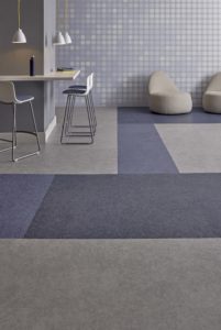
Cartersville, Ga.—Inspired by how differing shades can impact and enhance the built environment, Patcraft has introduced a variety of color-forward styles in 2018. These collections—ranging from carpet tile to resilient—have been designed to support the thoughtful use of color within a space, including its ability to stimulate emotions and thought processes and positively influence performance. Throughout the remainder of 2018, Patcraft will expand the color campaign with the introduction of new products and designs.
“Designers and end users are seeking to outfit their interiors with rich hues that can directly influence a space—whether making an emotional impact or enhancing functionality,” said Shannon Cochran, vice president, creative and design, Patcraft. “Following these trends, our design team developed several collections influenced by studies and research which show how color stimulates the human brain.”
Launching four new collections that combine the results of scientific research with flooring and colorful design trends, designers will have a range of choices to explore how the intentional use of color can transform an environment. Within learning environments, products balance a base of functional neutrals with captivating colors to inject energy into educational spaces. The vast selection of colors and custom options will inspire students of all ages to learn, create and achieve. Within corporate environments, where collaboration has been linked to innovation and creativity, there is a greater need for color to help distinguish spaces, using yellows to stimulate creativity and blues to cool down distractions.
Patcraft’s 2018 color collections include:
- AdMix Encore: Nightingale award-winning resilient flooring featuring homogeneous construction and a seamless moisture barrier. Products incorporate bright colors for accents, wayfinding and branding options while fostering further flexibility in the creation of spaces.
- Tangible Hue: Carpet tile collection inspired by the appeal of creating bright, uplifting spaces. The products are infused with color, offering designers, end users and facility managers a beautiful range of color palettes for impactful commercial design. Available in 24” x 24” tiles.
- Crossover: Resilient flooring with an expanded colorway, which includes both updated wood visuals and bright colorful textures. The lively color palette gives designers a range of options to help set the tone of a space and guide the functionality of an environment.
- CMYK: Available in 12” x 24” tiles, CMYK is visually textured LVT tile that is offered in a range of 24 vibrant colors and versatile neutrals tones to support branding, wayfinding, color blocking and mixing vision.
